Britanika Holding a.s., part of RENOMIA group focuses on insurance, investments and financial advisory. The company's mission is to help people find the best solution for their current financial situation. The name Britanika symbolizes the tradition, quality and credibility of British finance.
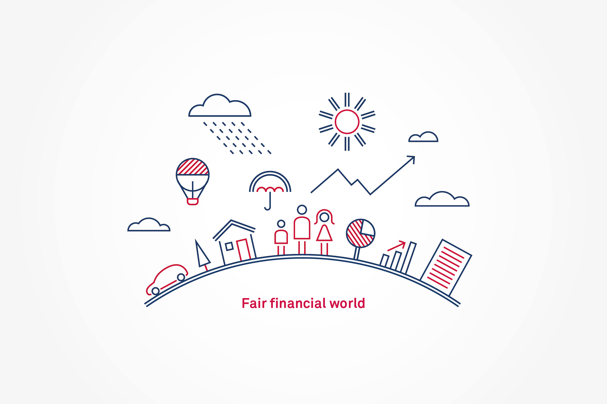

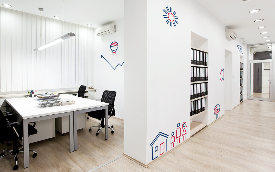

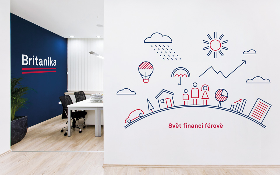

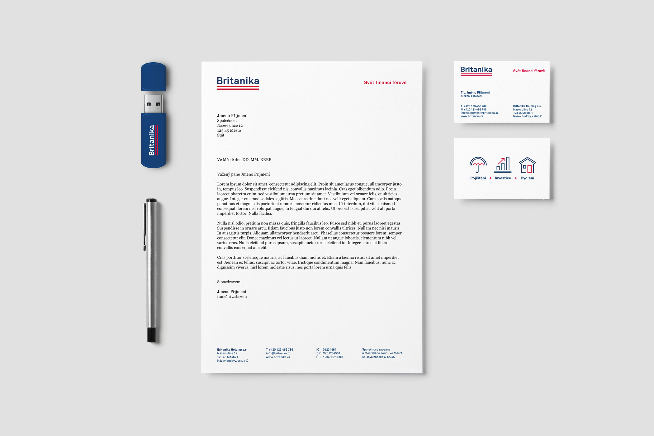
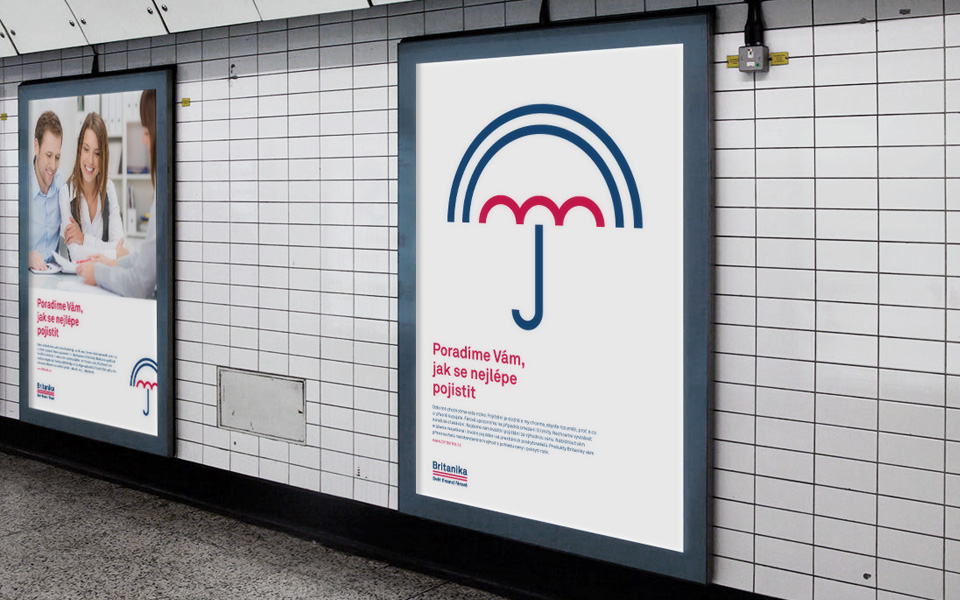
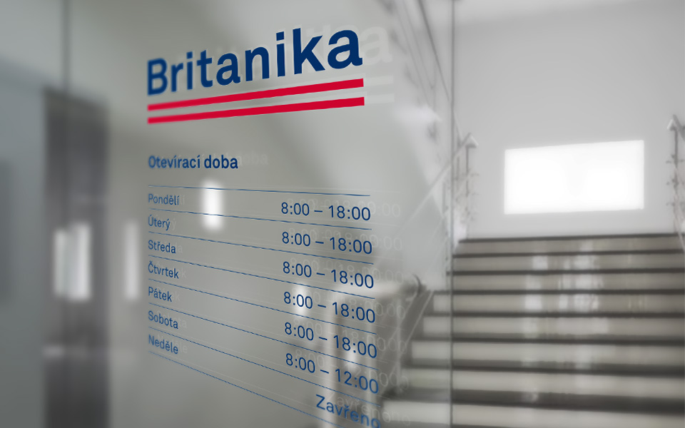
The company is based on the value of fairness, which is present in the logotype in a form of a stretched equal sign. This double line also refers to a counting process where the results are usually underlined twice. Furthemore it is used in the iconography and illustrations helping to connect the visual style with the logotype. By combining icons of individual services and other elements, world of finance was created contributing to the playful character of this visual identity.



Year: 2015
Agency: Dynamo design
Category: Visual identity
